skip to main | skip to sidebar

INTERACTIVE DESIGN - ADAM

Tuesday, June 2, 2009

Vilvi, only Cool

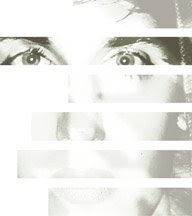
This typographic poster for Vilvi e-zine was found on the type blog Inquietto. It is another example of a typeface which uses depth, light, and material. This rubberband or ribbon-like font flows elegantly from letter to letter. I’ve become very interested in fonts that use space as a main characteristic.
Posted by atpruden at 9:26 PM

No comments:

Post a Comment

Newer Post Older Post Home
Subscribe to: Post Comments (Atom)

My Blog List

  • Digital Design
    Oval Face Thick Hairstyles That Will Make You Look Amazing
    1 year ago
  • JIN HEE
    Design
    10 years ago
  • happyeverafter
    NOSAJ THING- Brainfeeder Sessions in DTLA
    15 years ago
  • GDDB
    Website of the Week 12!
    16 years ago
  • design thinking
  • michelle's wonderland
  • pratt

Blog Archive

  • ▼  2009 (35)
    • ▼  June (21)
      • Dear God,
      • This article from TheCoolHunter is a good follow-u...
      • Acqua Veritas
      • Can the Spam
      • Best Cities for Millenials
      • CityCargo
      • 10 Creative Rubik's Cubes
      • USB subculture
      • Baubike
      • Atmospheric Intoxication
      • Tempting Fruit
      • Twitter Hype?
      • Flooded London
      • Apple’s kick-ass App Display Wall
      • Vilvi, only Cool
      • Tara Donovan – From Paper Cups to Genius
      • Cardiopulmonary-spatialization
      • Touching the Future
      • How Companies Use Twitter
      • Secondary Forests
      • Good Resource for Infographics
    • ►  May (14)
  • ►  2008 (15)
    • ►  December (3)
    • ►  November (3)
    • ►  October (4)
    • ►  September (5)

About Me

My photo
atpruden
View my complete profile