Section Seven is a graphic design firm. It's website uses color, motion, and sliding as a way of organizing its content. The transition from loading graphic to the firms portfolio is harmonious, simple, and clever. The 3d motion of the 'flipping book' creates a fun and unique experience for the viewer.
Monday, September 29, 2008
Tuesday, September 16, 2008
SITE OF THE WEEK
www.loisjeans.com
Lois Jeans is a clothing designer's website. The site plays with the idea of depth, movement, and space. The products/pictures on the website can be viewed in three different formats: in the shape of the company's name, shape of the logo, and a standard grid. Small movements of the mouse cause the picture display to slide through 3d space on a 2d plane.
Lois Jeans is a clothing designer's website. The site plays with the idea of depth, movement, and space. The products/pictures on the website can be viewed in three different formats: in the shape of the company's name, shape of the logo, and a standard grid. Small movements of the mouse cause the picture display to slide through 3d space on a 2d plane.
Tuesday, September 9, 2008
SITE OF THE WEEK
www.selftitled.ca
Self-titled is a personal and professional website of a multimedia developers work. The navigation is the most exciting part of this website. It is very intuitively simple, and relies mostly on motion and symbols for navigation, rather than words. There is a circular navigation dial in the center similar to the navigation dial of an IPod. I love websites that engage the user without confusion and over-design.
Self-titled is a personal and professional website of a multimedia developers work. The navigation is the most exciting part of this website. It is very intuitively simple, and relies mostly on motion and symbols for navigation, rather than words. There is a circular navigation dial in the center similar to the navigation dial of an IPod. I love websites that engage the user without confusion and over-design.
Monday, September 8, 2008
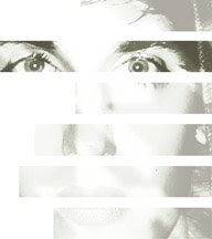
Taking Out Contacts
I chose to photograph, denotatively, "taking out contacts" because the visual of duplication in the mirror was intriguing. While taking the last photo I realized transformation from "contacts to glasses" had been recorded. After reviewing the photos I found connotative themes of reversal, transformation, and reflection. I discovered that the photo order can be reversed and evoke similar emotions.


Saturday, September 6, 2008
SITE OF THE WEEK
www.tiltdesignstudio.com
tilt is a multi-disciplinary design studio working with web, print, & motion graphics. I want to share this site, not only for the great examples of creative work, but also as an example of a great visual and navigational website. The studio's projects are displayed in an easy to navigate grid system with a black background which cause the colorful images to pop on the screen. The movements of the site (mostly sliding motions) make exploring its contents quick and fun.
Subscribe to:
Posts (Atom)